Tattoo Composition
Tattoo composition, drawn to fit the body.
Before I tattooed, my father talked with me a lot about photography and composition. That stuck. After more than 25 years of large-scale work in San Diego, I still think composition is the art: the subject matters, but where the shapes sit on the body is what makes a tattoo look like it belongs there.
This page walks through how I compose a body suit, step by step, using two full designs, front and back. It's the same way of thinking I use for a sleeve, a back piece, or a single section that may grow later.
See the process Watch the 3-minute videoDesigning on the Body
The whole process in three minutes
For years I've been building a tool for this called Body Wrap. It's where my flat templates, flow maps and composition guides live, scaled to a real person's measurements. The video is a screen recording of it in use:
- Setting up a full-body template from a client's measurements
- Drawing the composition in layers over the template
- Laying in color and checking the design on the body
- The finished front and back designs, and the leg sections up close
- The lesson that explains each step
The rest of this page breaks those steps down.
Why it comes first
A tattoo sits on a round, moving form
A design drawn flat on paper and then pasted onto an arm almost never fits. The body has its own rhythm, and the tattoo should follow it.
Landmarks
Elbows, knees, the navel and the chest are fixed points. Good composition works around them on purpose instead of letting a key detail land in a fold.
Rhythm lines
Lines that follow the curve of the muscles carry the eye down the limbs and around the torso. The big shapes are hung on these lines.
Open skin
Bare skin is part of the design. Open channels let the work breathe and keep it readable decades later.
The Process
How a body suit gets composed, step by step
Two full designs were drawn this way, a front and a back, with no reference. The steps are the same every time.
01
Start from the real body
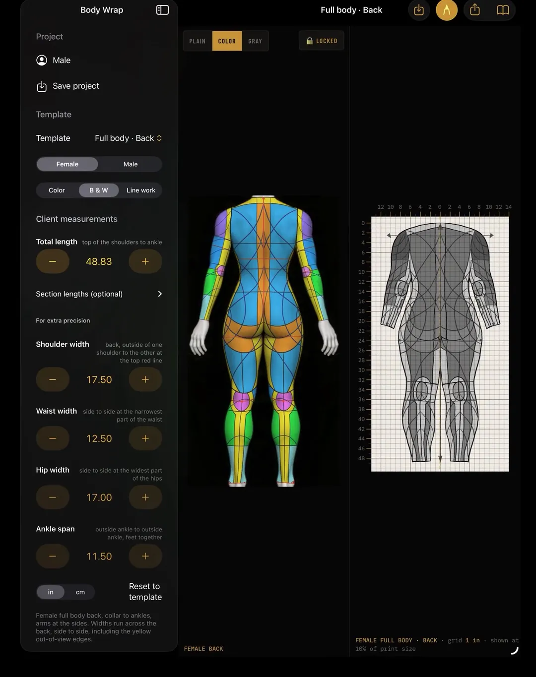
Every template starts with one number: total length, from the top of the shoulders to the ankle. Most bodies land close to average spacing from there. For extra precision I add shoulder, waist, hip and ankle widths.
The flat template scales to those numbers while a 1-inch grid stays true size, so what I draw on paper matches what goes on skin.
02
Map the regions and the flow
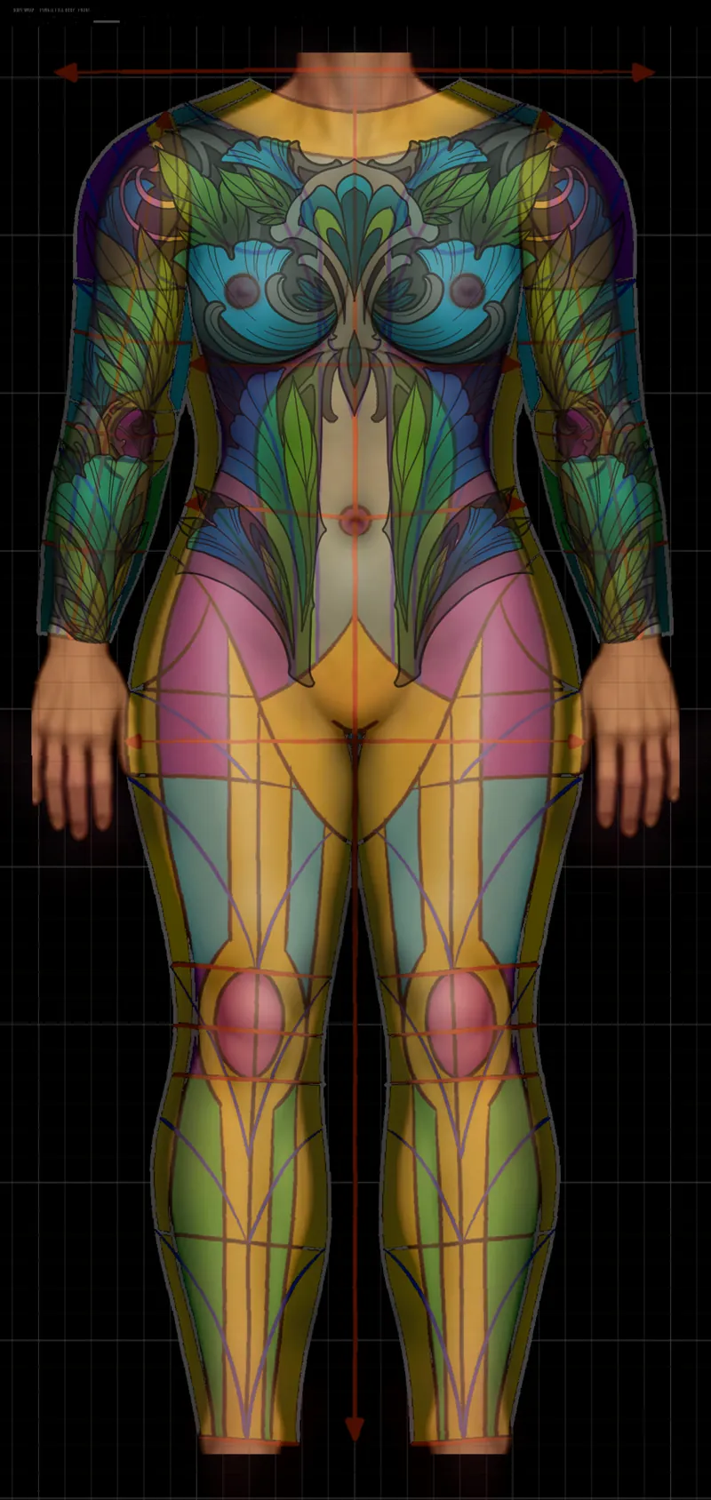
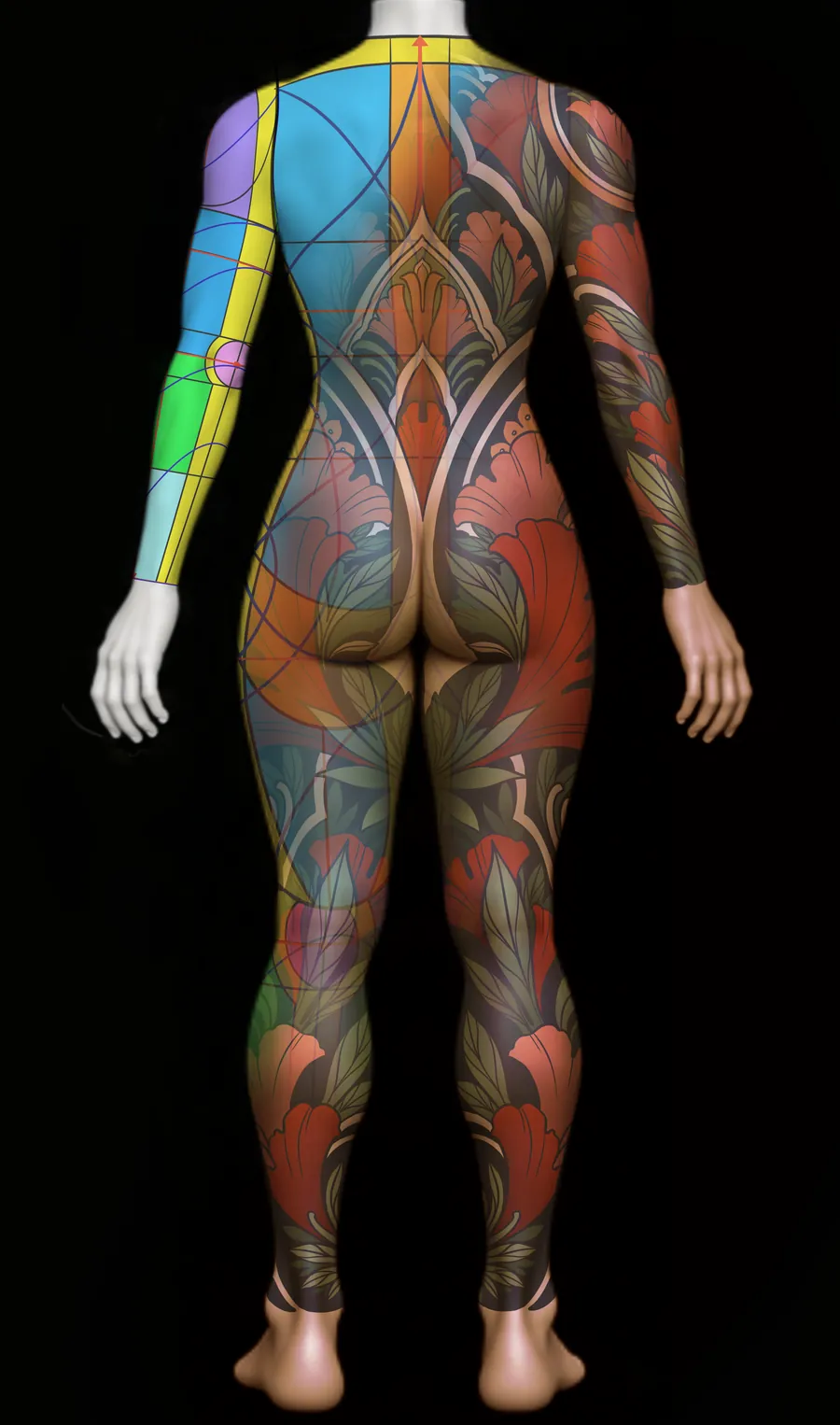
Next the body gets broken into regions, my flow map. Each color is a zone that a large shape can own. Circles mark the joints and landmarks. The lines show the direction the design should travel.
This is the part that took me the longest to work out and the part I'd most like other artists to have. Once the regions are clear, a body suit stops being overwhelming. It becomes a set of simple, readable shapes that connect.
03
Sketch the big shapes loose
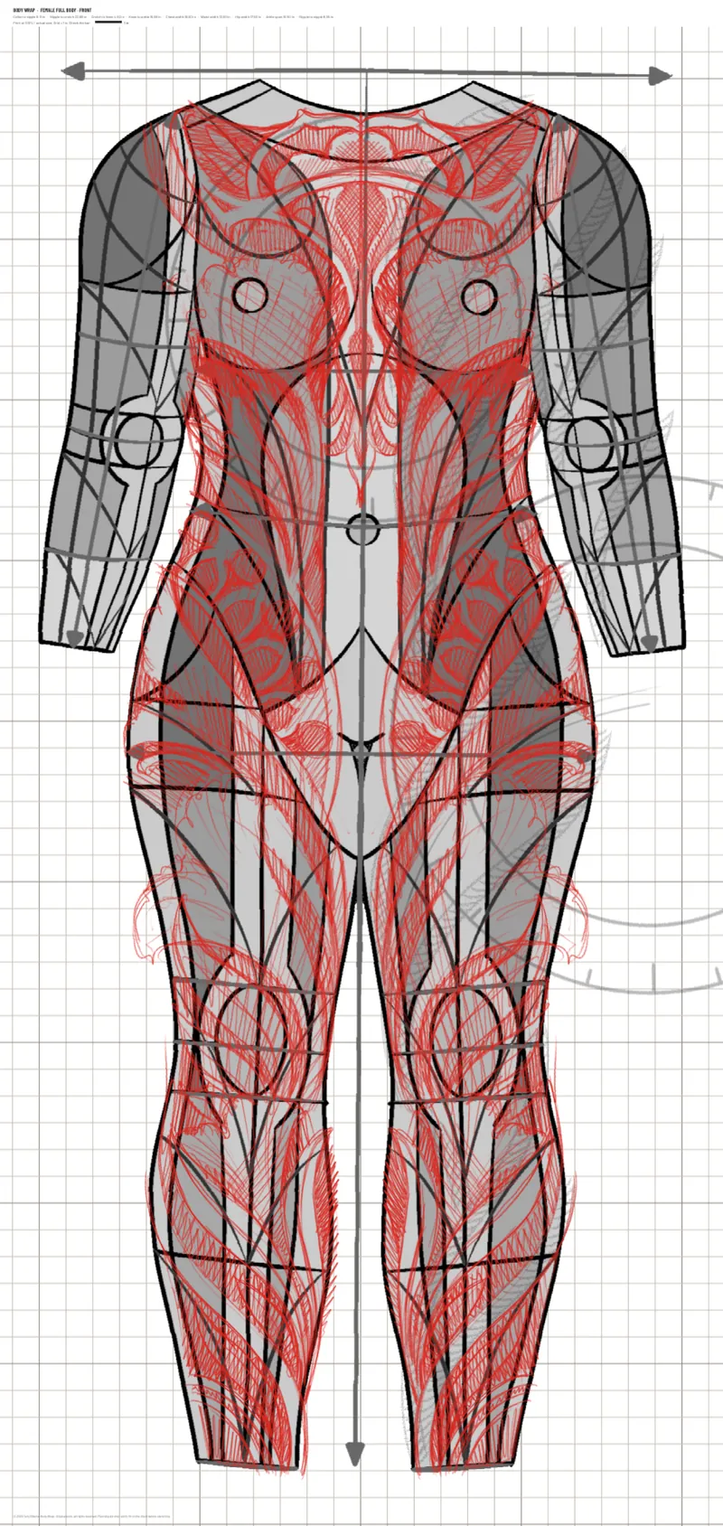
With the regions in place, I sketch loose and fast over the flat template, mirrored down the center line. At this stage it's only about the big masses and how they connect. Detail comes much later.
If the composition doesn't work as rough shapes, no amount of detail will save it.
04
Draw it on the body
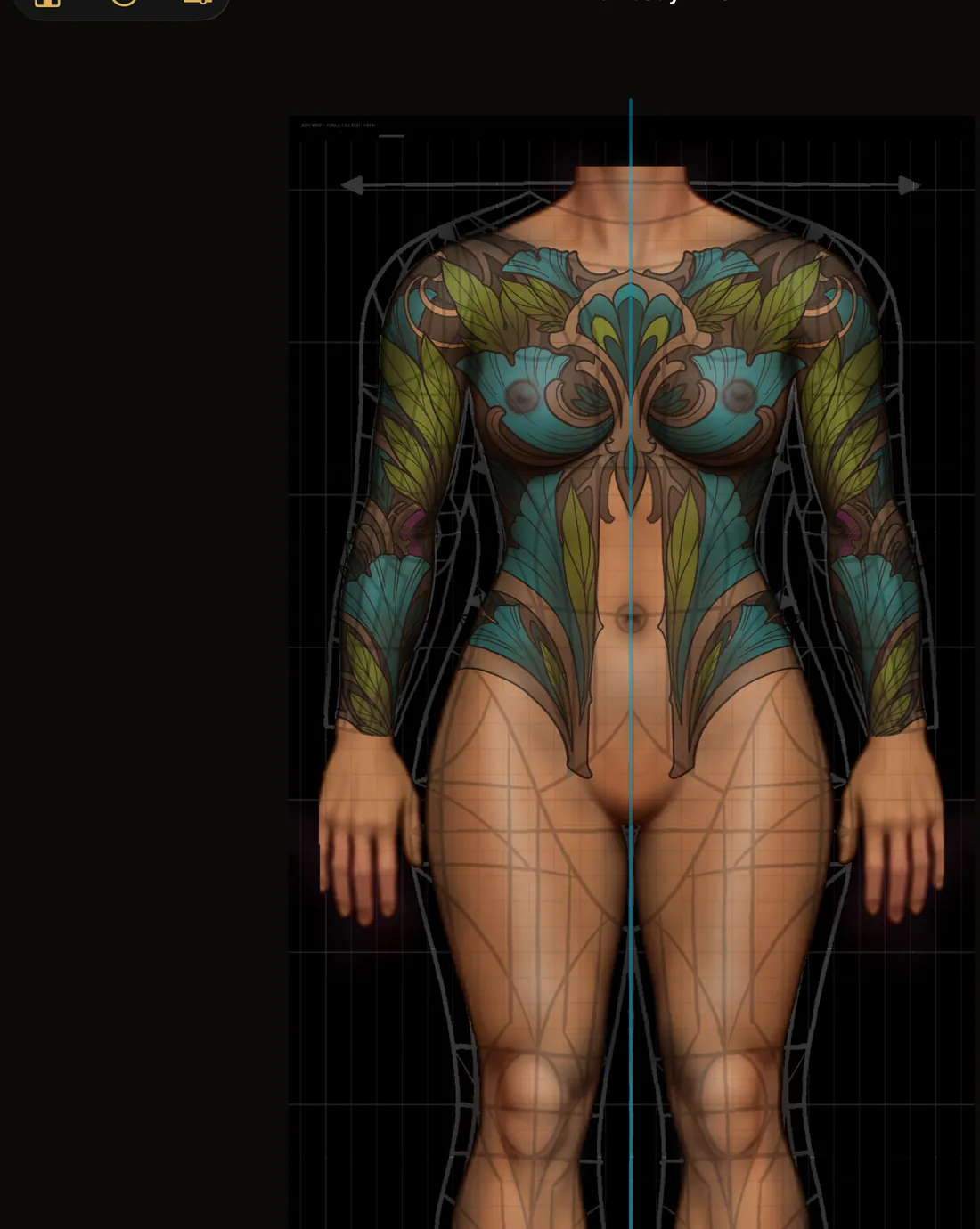
Then the drawing moves onto the body view. I check the design against the actual form and mirror one side to the other, so the symmetry holds across the chest, ribs and arms.
This is where the shapes get tightened: making sure a bloom sits on a rounded form, a leaf connector bends with the limb, and the open channels down the center stay clean.
05
Color with a simple logic
Both designs use the same color logic with a different palette:
- One hero color for the big masses. Gold on the front and red on the back fill the largest shapes, which sit on the roundest forms: chest, shoulders, glutes and thighs. Warm color advances, so it pushes those forms forward.
- A cooler color for the connectors. Greens fill the leaves that link one large shape to the next and carry the eye down the limbs.
- Dark background and open skin. A slate or near-black ground stays behind everything, and the open skin channels stay bare.
Color goes down in the same order every time: greens first, then the hero color, then refinement.
Front · gold & green
Back · red & sage
The Result
Two designs, one system
Front and back are separate compositions with separate palettes. They follow the same rules, so they read as one suit.
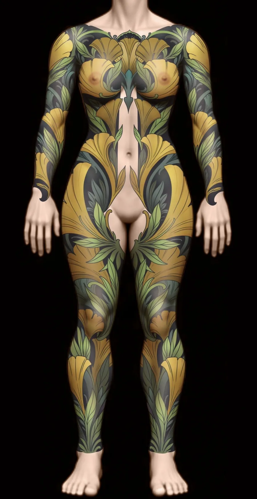
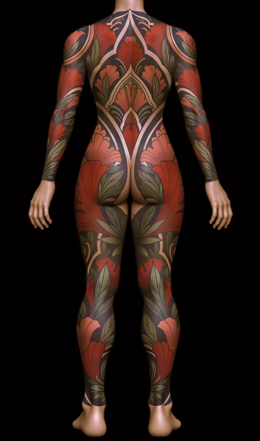
These are design concepts shown on a digital body, not photos of healed tattoos. For finished work on real clients, see body suits and sleeves. The same floral design is shown as linework, blackwork, black and grey, and color in floral art nouveau tattoo design.
Where it comes from
Learned from the masters, simplified on purpose
When I started tattooing at Tahiti Felix's Master Tattoo in 2000, I was lucky to learn around artists already focused on large-scale work. Around the same time, books like Guy Aitchison's Reinventing the Tattoo showed me how people were thinking about the body as a whole.
Alphonse Mucha's poster compositions are still my biggest influence, along with the great Japanese tattoo masters and Ed Hardy. What I've tried to do since is simplify that approach and break it into steps: regions of the body, simple legible shapes, and practice on the landmarks and rhythm lines.
The goal is for anyone, client or artist, to understand why a large tattoo fits, not just that it does.
Questions
Tattoo composition FAQ
What is tattoo composition?
Composition is how the shapes in a tattoo are arranged on the body: where the big masses sit, how the eye travels, where the open skin stays open, and how the design follows the muscles and joints underneath. A strong subject drawn without composition fights the body. A simple design composed for the body looks like it grew there.
What is a tattoo flow map?
A flow map breaks the body into regions, each one a zone that a single large shape can own. Circles mark the joints and landmarks, and lines show the direction the design should travel. The composition is drawn over it, so a body suit becomes a set of simple, readable shapes that connect.
Are the designs on this page real tattoos?
No. They are two body suit design concepts, front and back, shown on a digital body to demonstrate the composition process step by step. Finished work on real clients is in the body suit and style galleries.
How does composition help a tattoo age well?
Large, readable shapes, solid black, and deliberate open skin hold up for decades. Small crowded detail blurs together over time. Composing at scale first, then adding detail inside those shapes, keeps the tattoo legible as it ages.
Start the Conversation
Have a large piece in mind?
Every design starts at a drawing consultation with you there, so the composition is built around your body from day one. I tattoo at Remington Tattoo in North Park, San Diego.
Book a consultation Read the FAQ